
Appearance
Dashboard
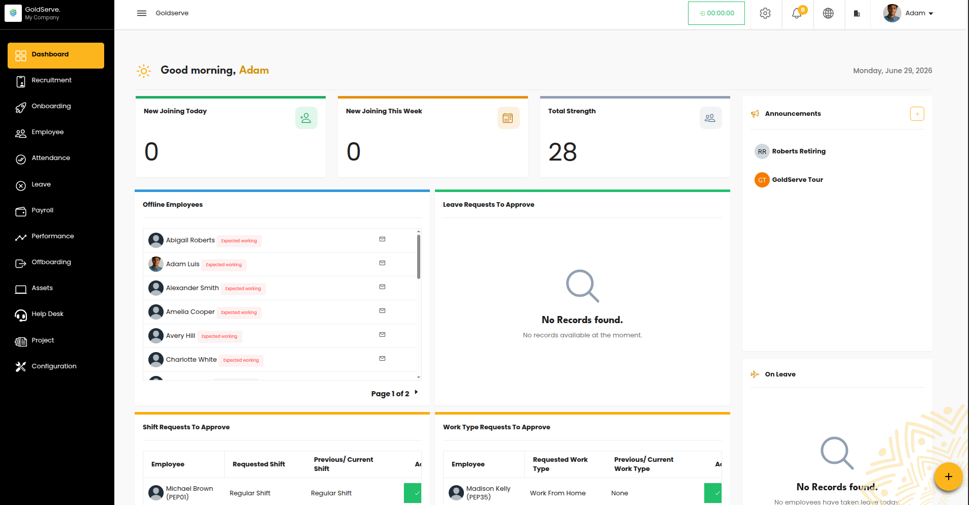
The Dashboard is the first thing people see when they sign in to GoldServe, and the first item in the main navigation. It's the home base of the system — a personalized, at-a-glance summary of what matters to each person the moment they log in.
This guide explains what the Dashboard is for, what different users see, how visibility is decided, and what can be personalized. No technical background needed.
Purpose
The Dashboard answers one question for every user: "What do I need to know or act on right now?"
Rather than making people hunt through different areas of the system, it pulls the most important information into one screen:
- A friendly, personalized welcome.
- Key headline numbers (for those who manage people).
- Items waiting for action (approvals and to-dos).
- Visual charts and trends.
- Company announcements, upcoming birthdays, and who's on leave.
It's designed to be a starting point — a quick orientation each morning — with shortcuts that take users straight to the relevant area when they need to dig deeper.
What's on the Dashboard
The Dashboard is arranged into a few clear areas:
1. Welcome header (everyone)
A personalized greeting at the top — "Good morning/afternoon/evening, [First name]" — alongside today's date. On a user's birthday, the screen celebrates with a brief animation.
2. Headline stat tiles (people who manage staff)
Quick-glance numbers such as:
- New Joining Today and New Joining This Week (when recruitment is in use).
- Total Strength — the overall headcount.
Each tile is a shortcut that opens the full list behind the number.
3. To-do & approval tiles (managers and approvers)
Action items that need attention, for example:
- Leave requests awaiting approval.
- Shift and work-type change requests.
- Attendance to validate and overtime to approve.
- Asset requests and performance feedback to respond to.
These appear only for the people responsible for them, so each user sees their own to-do list.
4. Charts and trends (personalized)
Visual summaries — headcount, attendance, leave, recruitment, performance, and more. Users choose which charts to display, building a view that suits their role (see Customization below).
5. Side panel (varies by role)
- Announcements — company-wide messages everyone can read.
- On Leave — who's away (for managers and HR).
- Birthdays — upcoming celebrations.
- Employee Work Information — a prompt showing whose records are incomplete, so HR and managers can follow up.
What Each User Sees
The Dashboard adapts to the person viewing it. The same screen looks quite different depending on the role:
| Dashboard area | Employee | Manager | HR Administrator |
|---|---|---|---|
| Welcome header & birthdays | ✅ | ✅ | ✅ |
| Announcements (read) | ✅ | ✅ | ✅ |
| Post an announcement | — | — | ✅ |
| Headline stat tiles (headcount, new joiners) | — | — | ✅ |
| Approval / to-do tiles | — | ✅ (for their team) | ✅ |
| "On Leave" list | — | ✅ | ✅ |
| Employee work-info follow-ups | — | ✅ (their team) | ✅ |
| Charts | Personal/permitted only | Team-level | Organization-wide |
In short:
- Employees get a clean, focused home: a greeting, announcements, birthdays, and any personal charts they're allowed to see. They don't see organization-wide numbers or other people's information.
- Managers additionally see what they need to lead their team — pending approvals, who's on leave, incomplete records, and team-level charts.
- HR Administrators see the broadest view — organization-wide headline numbers, all relevant approvals, full oversight charts, and the ability to post announcements.
Always role-appropriate
The exact mix always matches the person's responsibilities, so no one is shown information they shouldn't have.
How Visibility Is Decided
Three things determine what appears on a given person's Dashboard:
- Their role and access. Each section is tied to what the person is allowed to see. Someone who can view employee records sees the headcount tile; someone who can approve leave sees the leave-approval to-do, and so on. (See User Roles & Access.)
- Whether they manage a team. Managers automatically gain team-oriented sections — approvals, on-leave, and team charts — because they're responsible for their reports, even without special administrator access.
- Which modules are switched on. Sections only appear when the related area is active. For example, recruitment tiles show only if recruitment is in use; leave and attendance sections require those modules. If a client isn't using a module, its Dashboard content simply doesn't appear.
This means the Dashboard is self-adjusting: it never shows empty or irrelevant sections, and it never exposes information beyond a person's access.
Customization Options
The Dashboard is personal to each user and can be tailored:
- Choose your charts. Users pick which charts to display from the options available to them, creating a view that fits how they work. (The choices offered are always limited to what their role permits.)
- Rearrange the layout. Tiles can be dragged into the order a user prefers; their arrangement is remembered for next time.
- Guided tour. The first time someone opens the Dashboard, a short walkthrough highlights the key areas.
- Announcements. Authorized users (typically HR) can post company-wide announcements that appear on everyone's Dashboard.
Because each person's choices are saved to their own view, two users can set up their Dashboards very differently to match their needs.
Good to Know
- It's a launchpad, not a dead end. Most tiles and numbers are shortcuts — clicking through takes the user to the full details.
- Numbers reflect the selected company. In a multi-company setup, the Dashboard shows figures for the company the user is currently viewing (see company separation in User Roles & Access).
- It stays current. Counts, approvals, and lists reflect the latest information each time the Dashboard loads.
- Less clutter for most people. Because sections are role-aware, a typical employee sees a simple, uncluttered home, while administrators see a richer command center.
Your workday, at a glance.